Iconic green bottle
Protected the memory structure people already recognised.
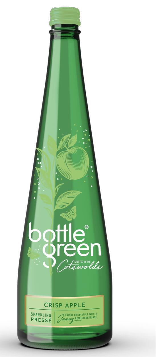
As brand strategy and stewardship lead, I helped re-establish the provenance, premium cues and distinctive character that made bottlegreen special in the first place.
bottlegreen was an original of the premium soft drinks category—but familiarity had begun to flatten what made it special.
The task was not to invent a different brand. It was to rediscover the value already held in its provenance, bottle, botanicals and quiet elegance.
Premium soft-drink drinkers cared about taste, aesthetics, quality and the role a beautiful bottle plays when hosting.
They already saw distinctiveness and luxury in the brand—but wanted stronger shelf standout, clearer navigation and more premium appeal.
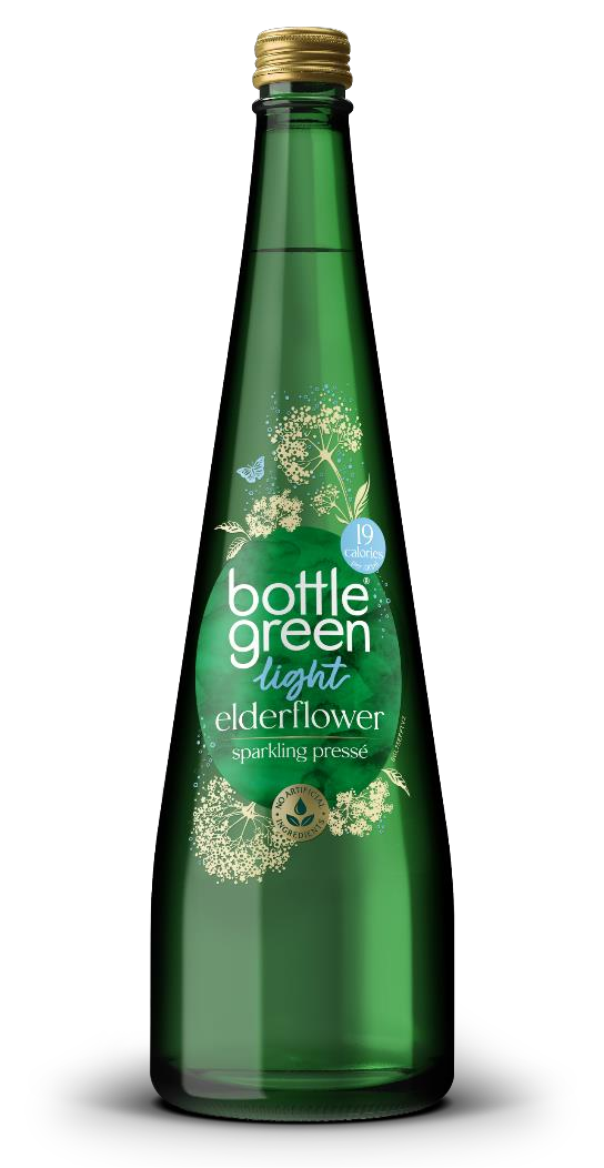
A simple thought that connected the product’s craft and elegance to a useful role in people’s lives: making ordinary moments feel considered.
Protected the memory structure people already recognised.
A larger, more contemporary logo made the brand easier to find.
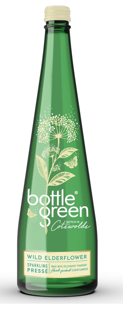
Botanical illustration and coloured caps improved navigation.
The brand’s birthplace returned as a meaningful premium cue.
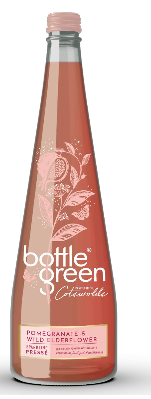
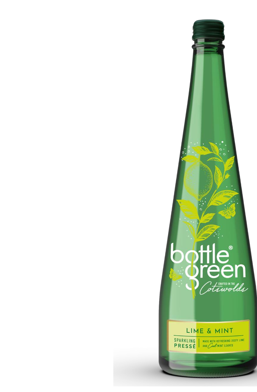
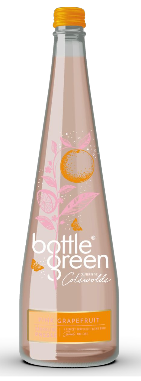
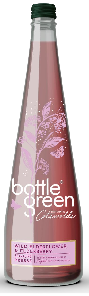
Working with the bottlegreen brand team, colleagues across SHS Drinks and our agency partners, I led the strategic direction and stewardship of the refresh, helping connect research, packaging, identity, provenance, portfolio and implementation around one coherent ambition.
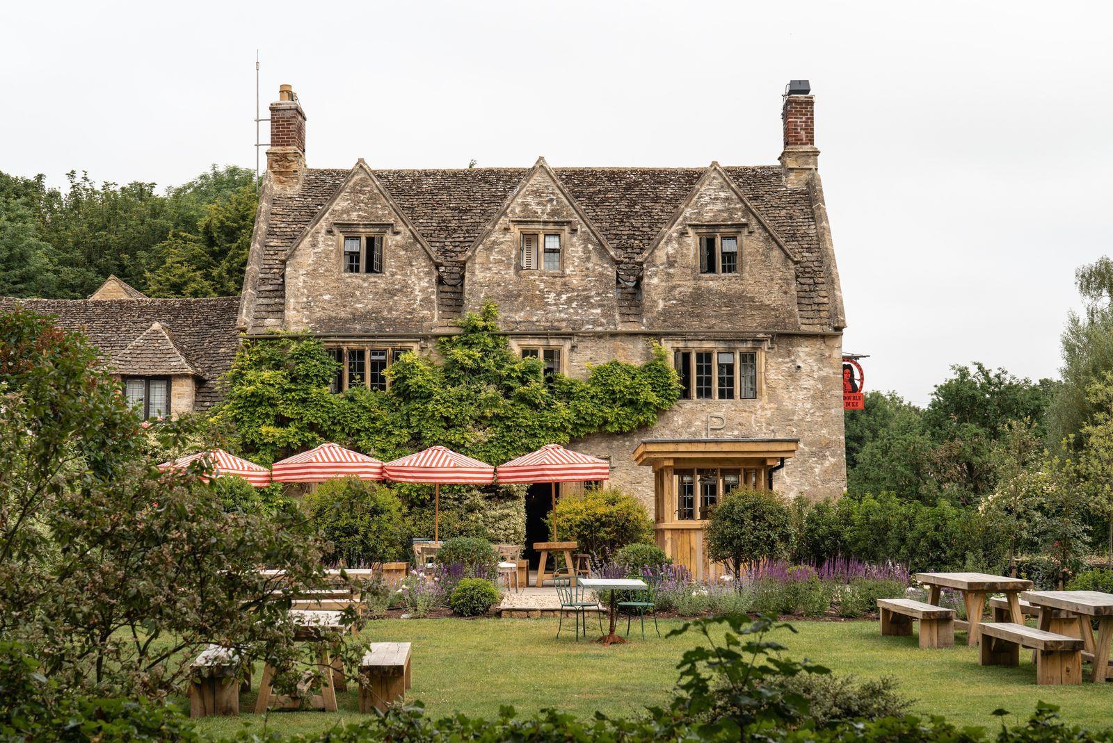
Provenance became more than a line on pack. It informed a richer activation world across premium venues, partnerships and cultural moments—giving the brand a recognisable place to come from and a more ownable place to go.
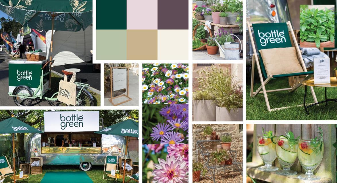
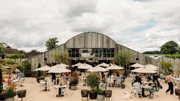
From premium hospitality to the Big Feastival: showing up in places that made the brand’s character tangible.
Brand For Me
Worth Paying More For
Strengthened Brand Advantage
The breakthrough was recognising that bottlegreen’s strongest distinctive assets were not outdated. They were under-exploited.
Don’t redesign what people remember.
Remind them why they remembered it.